SomeOne designs lattice-inspired identity for Graff
The new designs – including the brand’s first ever monogram – are inspired by the diamond jewellery specialist’s unique metalwork.
SomeOne has developed a new design system for diamond jewellery brand Graff, which was inspired by looking back at its archives and visiting its London workshop.
Established in the capital in 1960, Graff jewellery is known for its “deceptive simplicity, perfect balance and proportion, and sensuous, feminine power”, according to SomeOne founder and executive strategic creative director Simon Manchipp.
Graff had approached SomeOne directly, appointing it to create a new visual identity for the company – which formerly had never used a monogram or “ownable signifier”.
The new branding was designed to build on Graff’s “incredible foundations”, Manchipp adds; and while “nothing was broken” in the previous identity, the project saw SomeOne change all aspects of the visual language, from photographic sets, 3D modelling, and typographic systems to colour palettes, imagery and animations.
The SomeOne team initially visited Graff’s London workshop, where century-old traditional processes meet “cutting-edge innovations”, says Manchipp. Since Graff trainees learn skills and techniques unique to the company, “becoming a Graff master craftsman is akin to being entrusted with a book of secrets”, he continues.
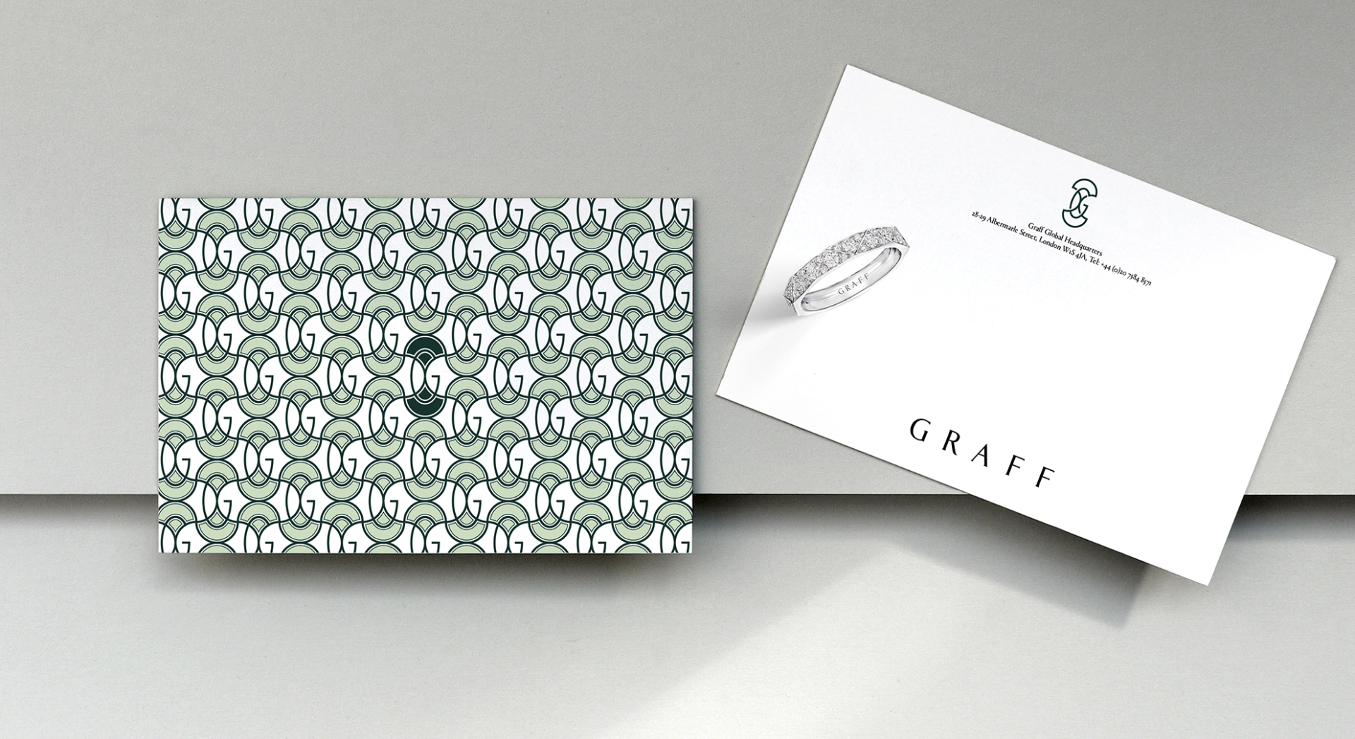
At the workshop, SomeOne’s designers were shown the details of the precious metalwork that holds the jewellery pieces’ diamonds in place.
This directly informed the new brand pattern, which is inspired by the unique Graff lattice found only on the back of its signature pieces.
The pattern “uniquely balances strength, elegance and the ability to suspend diamonds and gemstones above the skin”, meaning that light can shine through the gem “with even greater allure”, says Manchipp.
Graff’s new monogram – the first time it’s used any such symbol or mark – is also derived from the shapes used to make the Graff lattice.
A bespoke Graff word mark was hand drawn by the SomeOne team. This is supported by the typeface Portrait by Berton Hasebe, which was chosen thanks to its marriage of “classical proportions with triangular Latin serifs” according to Manchipp.
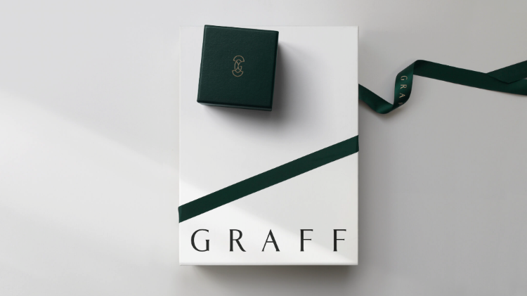
While the old identity used a variety of colours, Manchipp says it needed “a more defined system”. The brand’s historic use of British racing green informed the newly defined approach, which is largely based around the colour.
One of the main challenges of the project was in finding “a fine balance” to ensure that the assets and brand touch points did not “eclipse the jewellery”, Manchipp adds.
The new designs are used across all Graff packaging, stationery, its website and on other collateral, as well as on internal and external applications at its boutique on London’s New Bond Street.

-
Post a comment