“A world of wonder for pets” in Ragged Edge’s designs for Omlet
The new designs use tactile 3D illustrations and cute characters to “celebrate the bond between pets and people”.
Ragged Edge began its conversations with Omlet in March last year, and worked across its positioning, visual and verbal identity to help its products reach a global audience and “challenge the status quo on an international level”.
According to the agency, Omlet’s “pioneering” products buck recent trends in pet care by innovating on products according to its findings from studying pet behaviour. This means its range is based on animals’ needs, rather than the “assumptions” of humans who look after them, and innovating on products based on findings from studying pet behaviour.
 “The pet product category is full of stuff designed for humans – wendy-house chicken coops and toys that look like fast food. We’ve projected ourselves onto pets instead of designing for them,” says Max Ottignon, Ragged Edge co-founder.
“Omlet takes the opposite approach, starting from scratch to design solutions for pets, not people,” he continues. “Every product they create aims to deepen the connection between pets and their owners. That gave us rich territory to create a brand that was fundamentally different to anything out there. A world of wonder for pets and pet owners alike.”
The brand already had an existing loyal fanbase, but following a recent successful funding round it was looking for new branding that would help its international expansion. Ragged Edge was briefed to “build a stand-out brand to help them take their incredibly inventive, wonderfully thoughtful and beautifully designed products to the next level” by growing the brand globally, says Ottignon. “This was going to take more than just another pet brand,” he continues.
In the early stages of the project, Ragged Edge defined Omlet’s positioning to help it “transcend a fairly transactional category” by identifying and amplifying its point of difference. It landed on Omlet’s approach to designing products for pets rather than pet owners, as well as the brand’s “questioning nature,” says Ottignon.
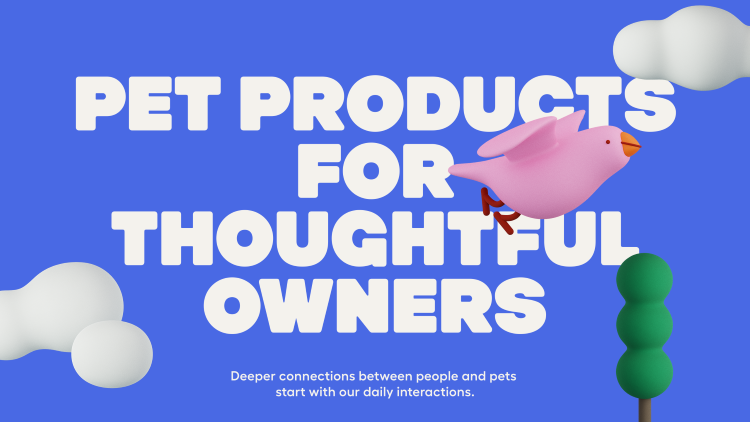
![]() From there, Ragged Edge came up with Omlet’s ‘big creative idea’, identified as ‘a world of wonder’. This was then brought to life across Omlet’s visual and verbal identity, spanning product packaging, the Omlet website, branded merch such as aprons, animations, and more.
From there, Ragged Edge came up with Omlet’s ‘big creative idea’, identified as ‘a world of wonder’. This was then brought to life across Omlet’s visual and verbal identity, spanning product packaging, the Omlet website, branded merch such as aprons, animations, and more.
Ragged Edge opted to take a 3D illustration-led approach, commissioning Holly Szczypka to create images inspired by product design prototypes. “[Szczypka] helped us create a style full of wit, that felt like it had a similar tactility to the Omlet products themselves,” says Ottignon. “So many brand illustration styles look the same, so we wanted to find a distinctive aesthetic that related directly back to the product but also acknowledged the bizarre ways our animals keep us occupied.”
The illustrations were then brought to life for motion applications by animator Adam Garbutt, further underscoring the idea of Omlet embracing the more humorous sides and “imperfections” of how we interact with pets.
Thanks to its existing brand equity, the new wordmark is largely based on Omlet’s former logo in terms of the shapes of its letterforms. Ragged Edge redrew it from scratch and exaggerated certain features: the ‘O’, for instance, capitalised on the Omlet name itself by becoming a “more pronounced egg shape”; while the overall lettering shapes were adjusted to align more with the brand’s product design language.
It was also important that the wordmark was versatile enough to appear on a range of different applications and materials, from online to printed touchpoints, packaging, and stitched into things like felt and tarpaulin.
The product design language was also a key driver in choosing Omlet’s headline typeface. Ragged Edge opted for Hammer Bold by Zurich-based type foundry Out Of The Dark thanks to it feeling “satisfyingly solid and durable”.
Swiss foundry Grilli Type’s GT Maru Mono is used as a supporting font since it “had a boilerplate feel to it”; while for body copy Fellix from Prage’s Displaay foundry for its “pleasant readability and warmth”.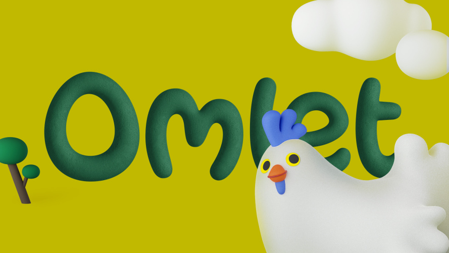
Omlet’s former brand colour palette of green has been tweaked to allow it to be more flexible across a range of applications. A secondary colour palette based on colours found in nature but exaggerated and brightened to feel more “magical” has been introduced to underscore the ‘world of wonder’ idea.
The new branding is gradually being introduced across Omlet’s channels over the coming months. Its products are sold through the Omlet website across the UK, US, Australia and throughout most of Europe.
-
Post a comment